UNM Campus
- Jan 18, 2011
- 2 min read
During recent holiday travel, Rob needed to take a walk down memory lane. The University of New Mexico talked of new Architecture Studios back when Rob was a student on campus. Now almost 30 years later the building is complete. After enjoying a green chile burger at Frontier, we just had to go exploring…
We quickly decided that the building is photogenic, as we had seen beautiful photos of it in alumni publications. Rob stopped to pose for a photo at the door. We were pleased to find the door un-locked and went in to take a look. The building is constructed without wall, ceiling or floor finishes at the interior. Presumably, this allows the students to understand the construction of the building because they can see it. However it was particularly challenging for the architects to present a clean, tidy, professional look. The mechanical, electrical and plumbing and fire suppression systems are all exposed. For example, you can see how the water gets to the toilet rooms and power to the lights. Nothing is a secret. Rob recalls that the studios were always a mess, so we did confirm that some things never change…
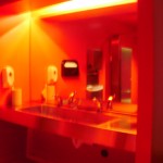
The coolest thing we found was a toilet room at the end of a corridor with a red glow…. Our curiosity drew us in where we found that the stainless steel counter tops and partitions were reflecting the paint color from the floor, walls and ceiling… Three standard can-light fixtures lighted the room that had been painted completely with bright, true red paint. We wonder if the designer planned it that way or just got lucky.. Either way, we learned of a cool new look to try. I like that the look was achieved with PAINT. No expensive tile, stone or other finish that is often prevented by a modest budget. It would be a cool look for a nightclub, sports arena, or other area that needs to be easily cleaned and very durable. The look offered practical durability with a low cost. I wonder if other colors, like orange, blue, green or pink work as well…. I also wonder if the look was achieved through the positioning of the lights. I accidently took a flash picture and the flash turned the look into a red room with stainless steel accents. In other words it eliminated the “glow”. I do know that it had much to do with the quantity of vertical stainless steel in the room because the Men’s room had less full height partitions, so the “glow” was less dramatic, Yes , I think too much, but that is a good thing when I am thinking for the benefit of your project!! That is what we Architects do. It all starts while exploring architecture near & far.








Comments